Cusp Chocolate
Cusp Chocolate
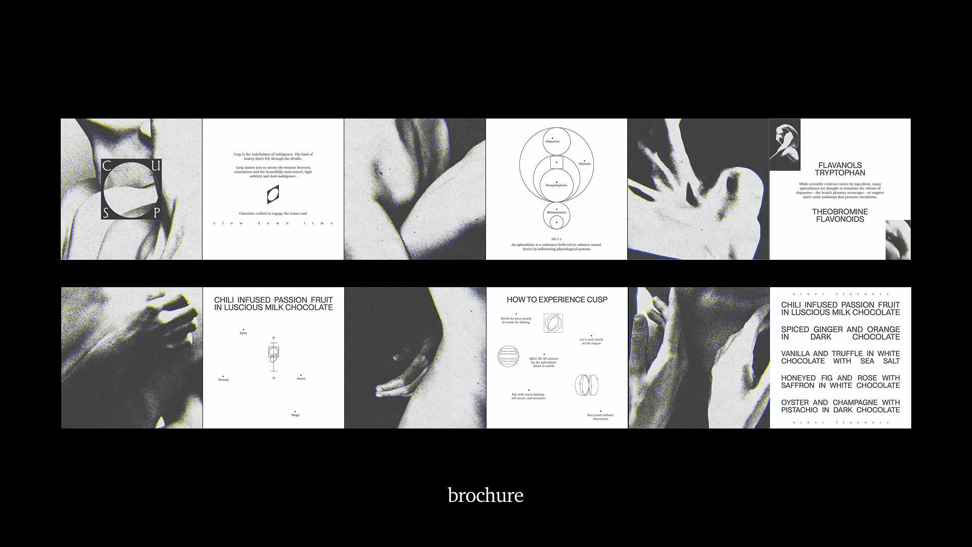
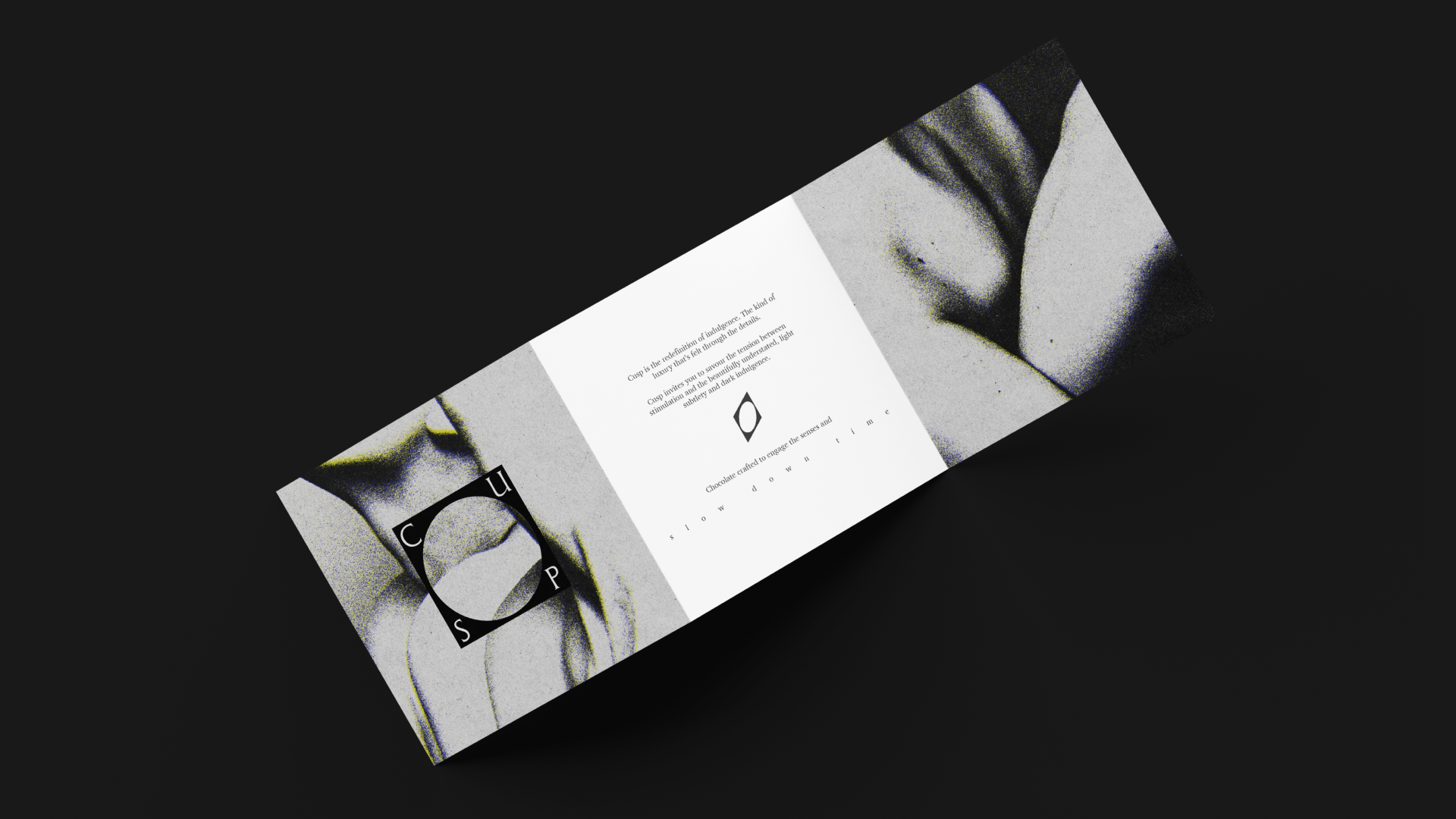
Cusp is a redefinition of indulgence. Chocolate crafted to awaken the senses and slow down time. It is the kind of luxury that’s felt through details, inviting you to savor the tension between stimulation and the beautifully understated, light subtlety and dark indulgence.
Design Credits:
Ananya Tatwadi, Anushri Shah, Danny Feng, Nicole Zhu
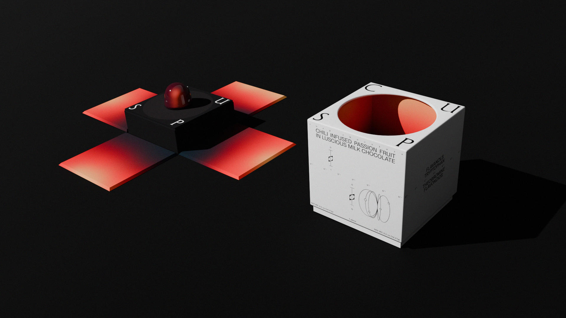
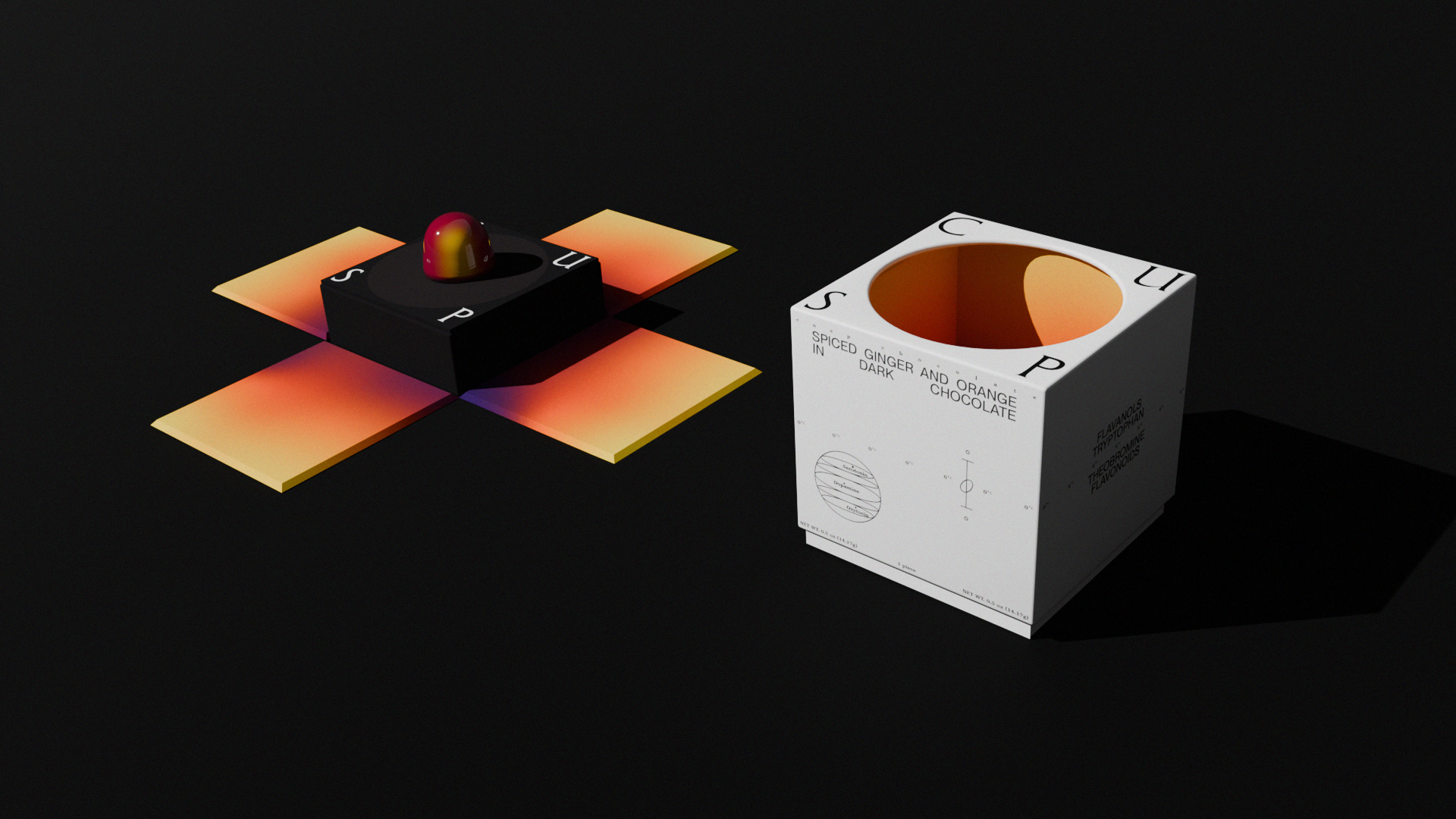
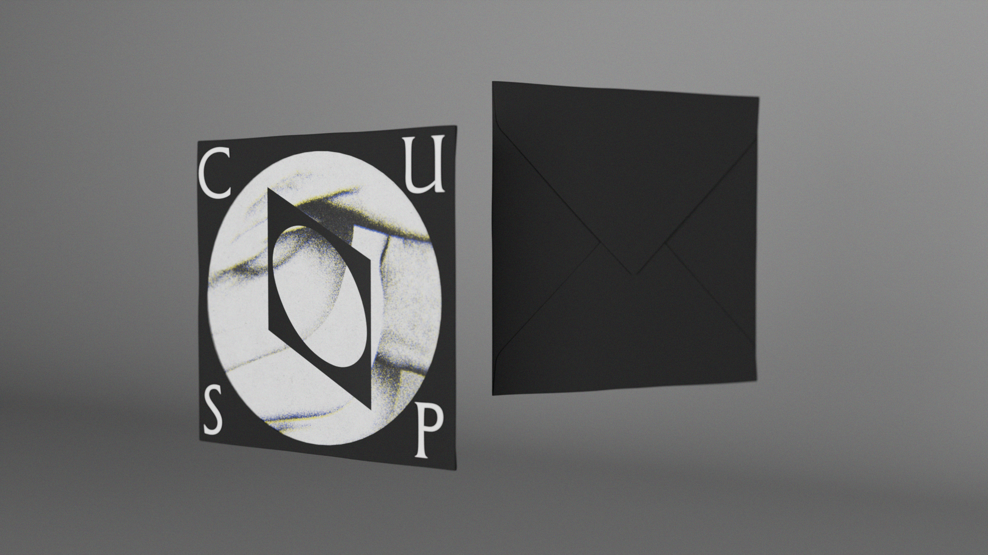
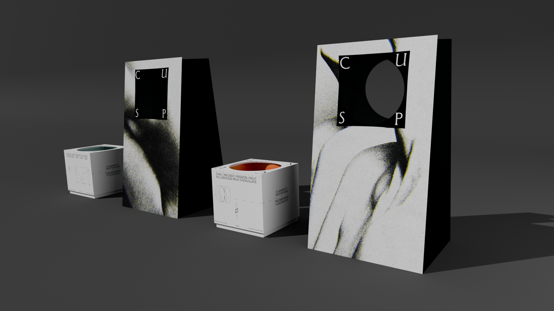
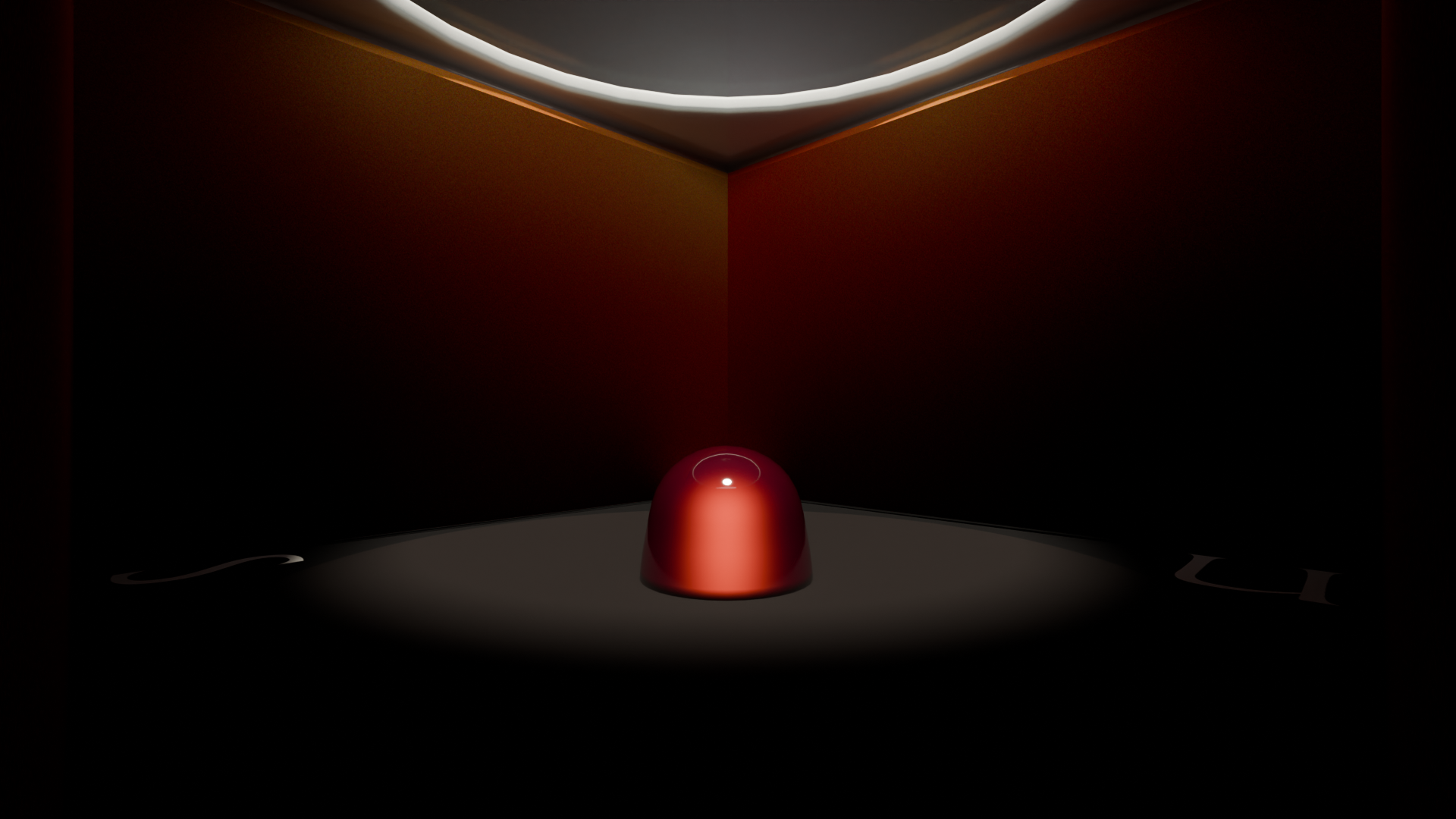
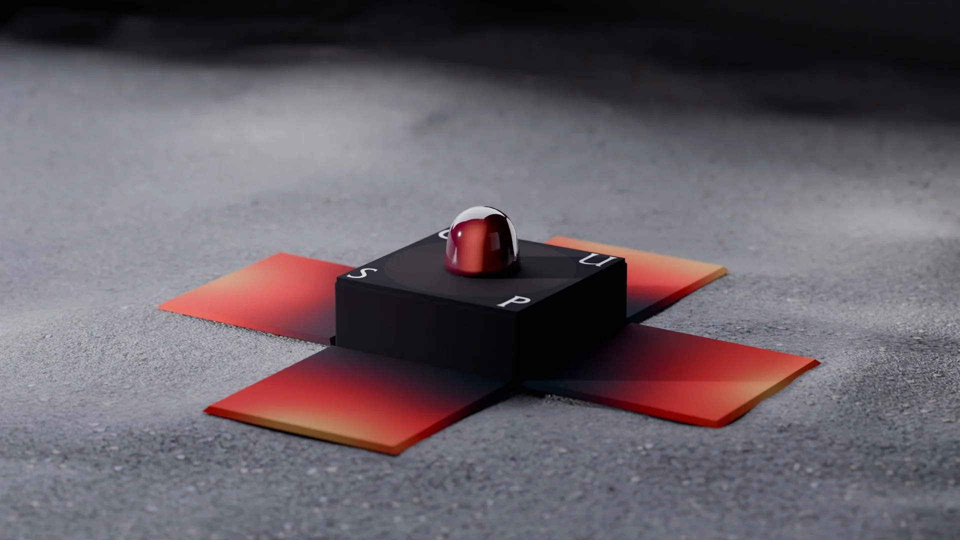
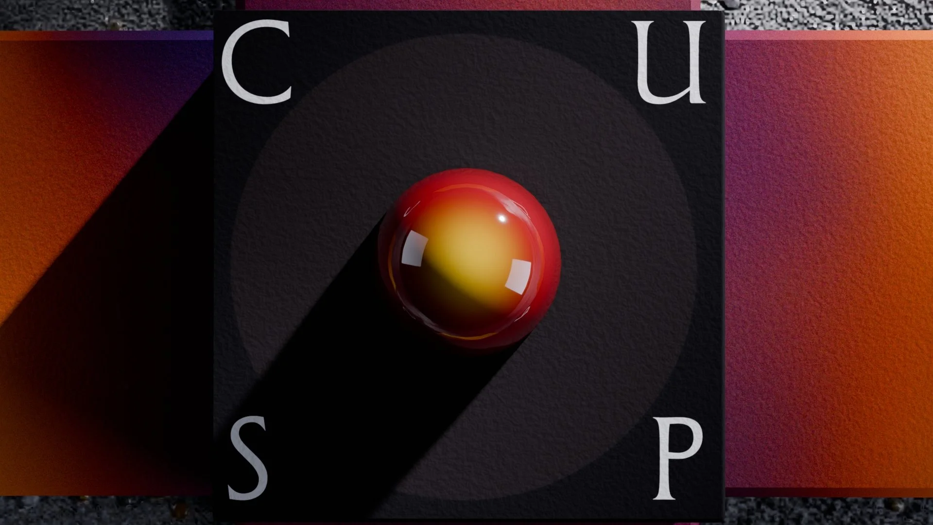
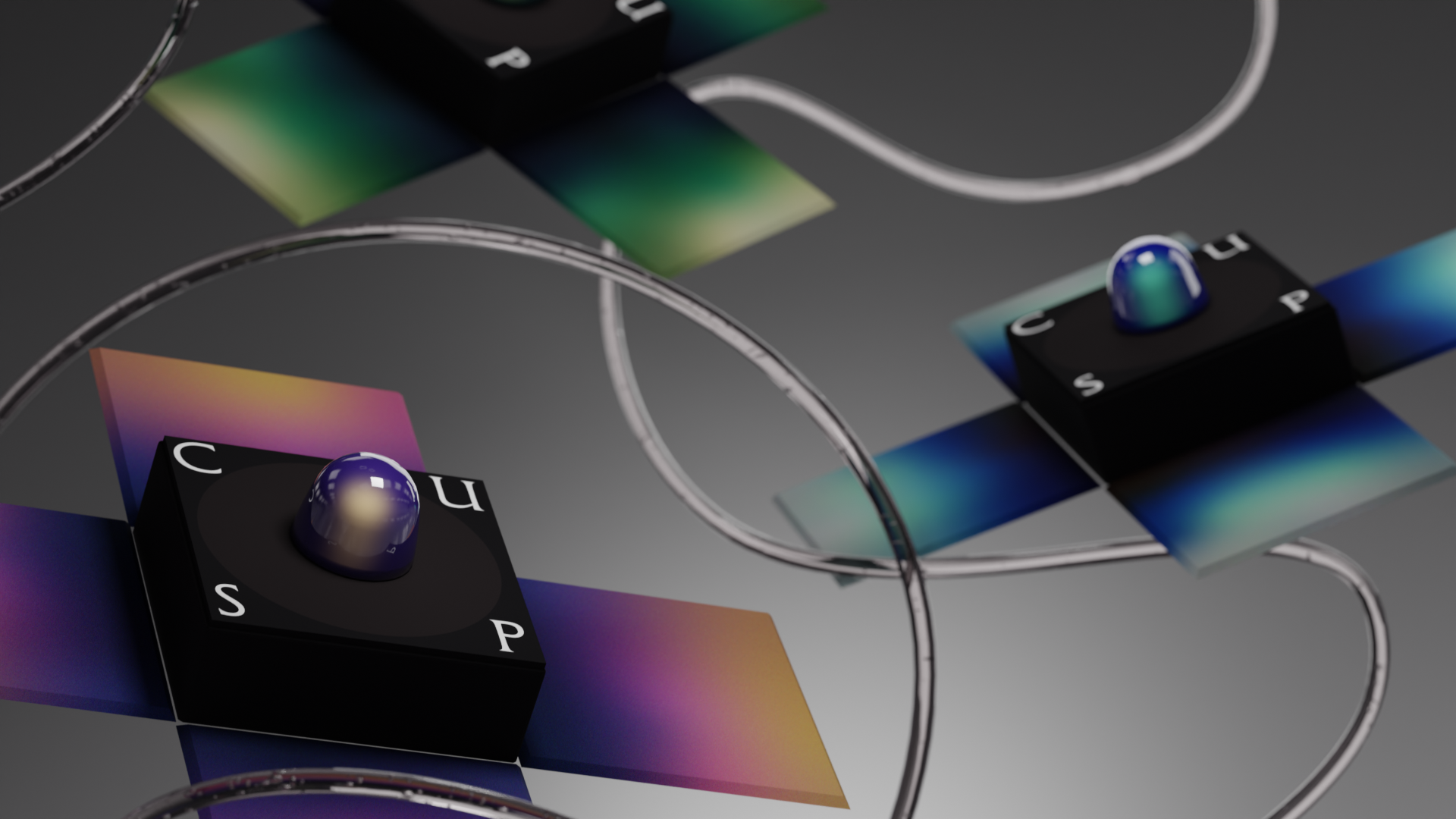
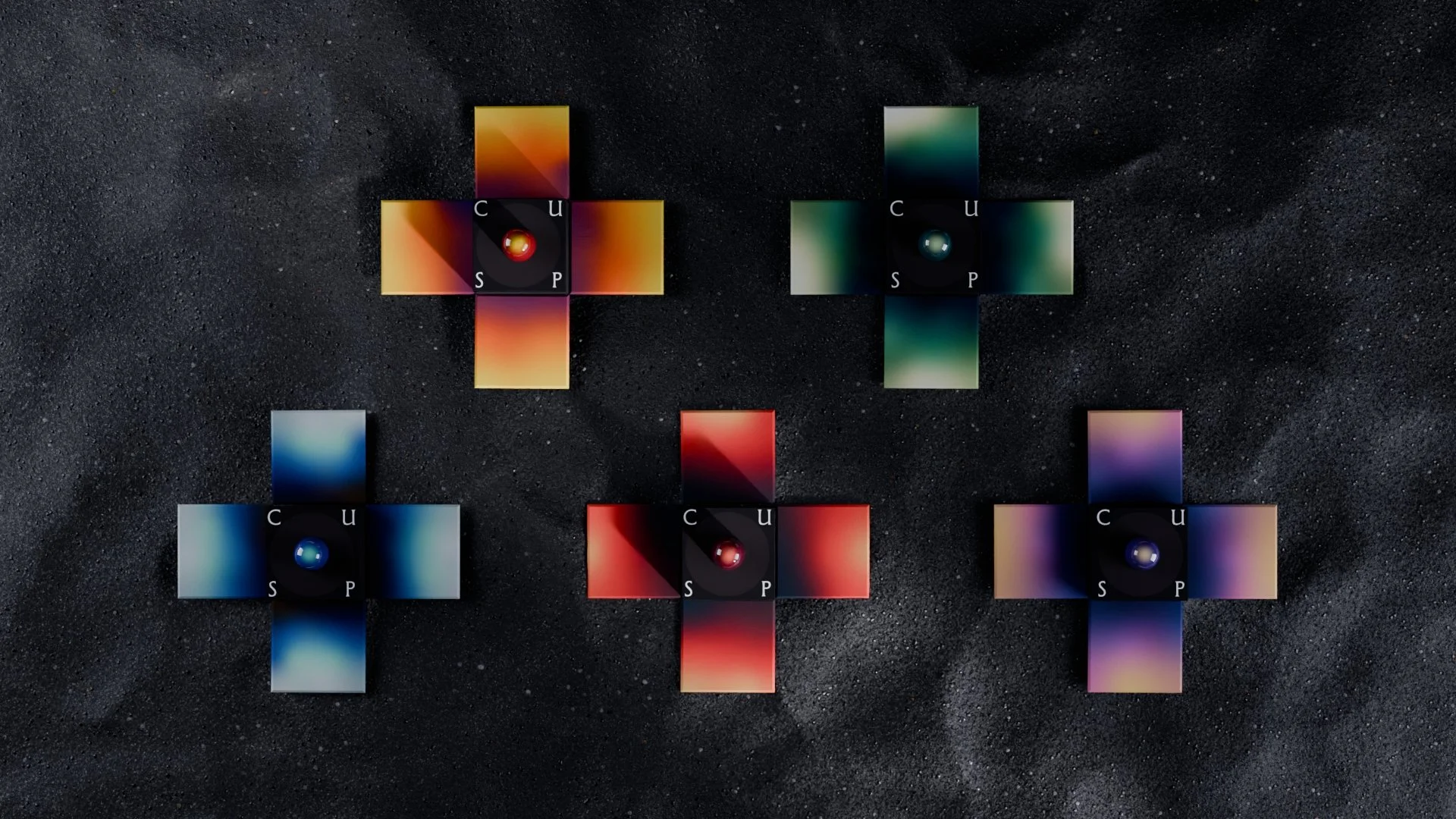
The CUSP logo is inspired by light breaking into a space, much like a skylight carving a sharp, deliberate beam into the dark.
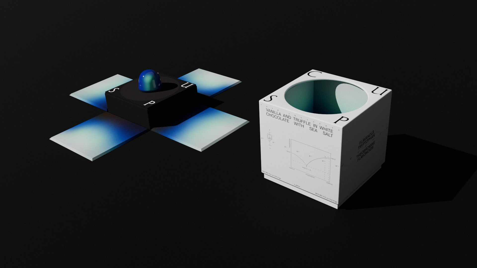
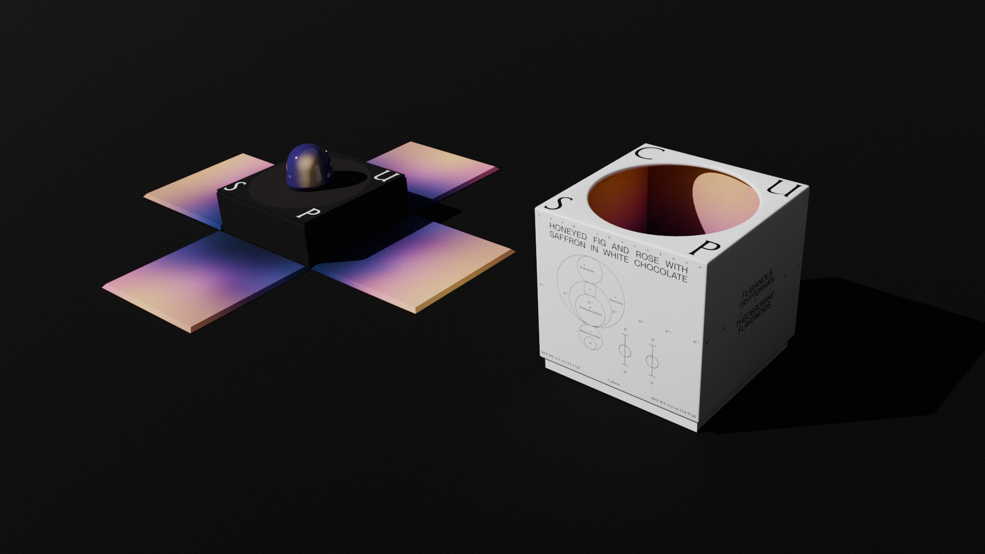
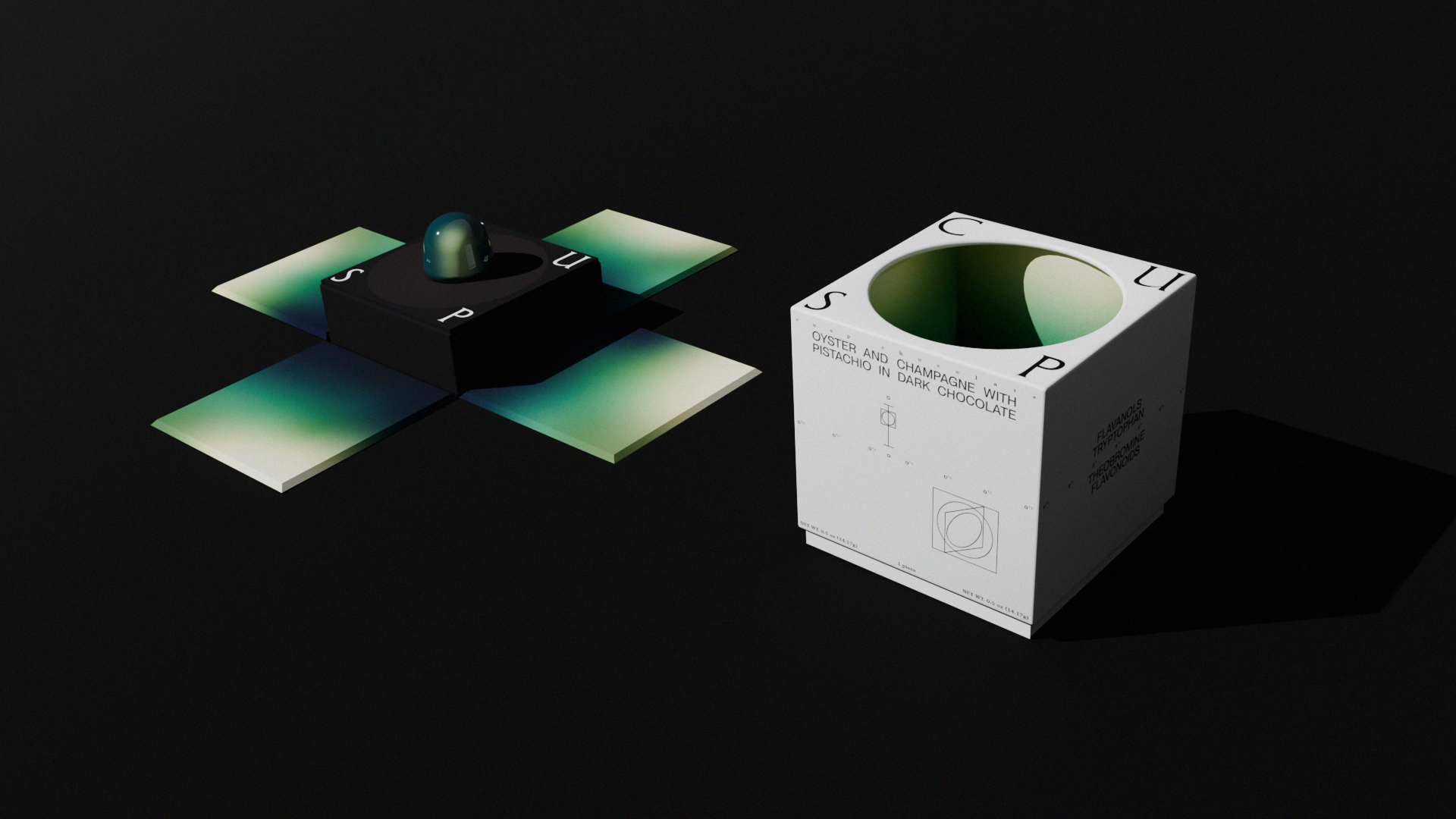
The letters CUSP sit on the edges of the square, each positioned on the cusp of the boundary. Their placement reinforces the brand’s core idea of indulgence and restraint and between dark and light.

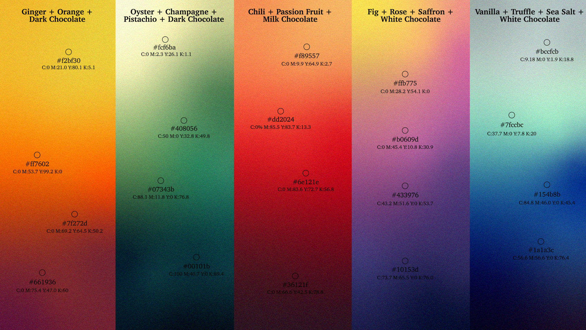
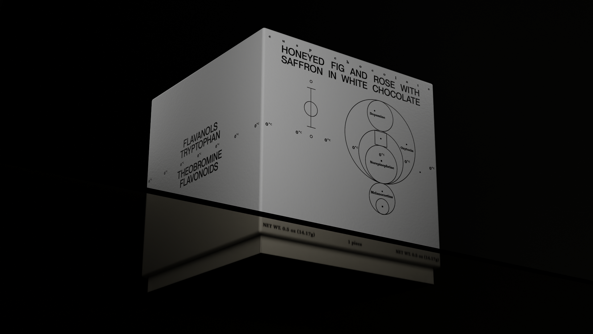
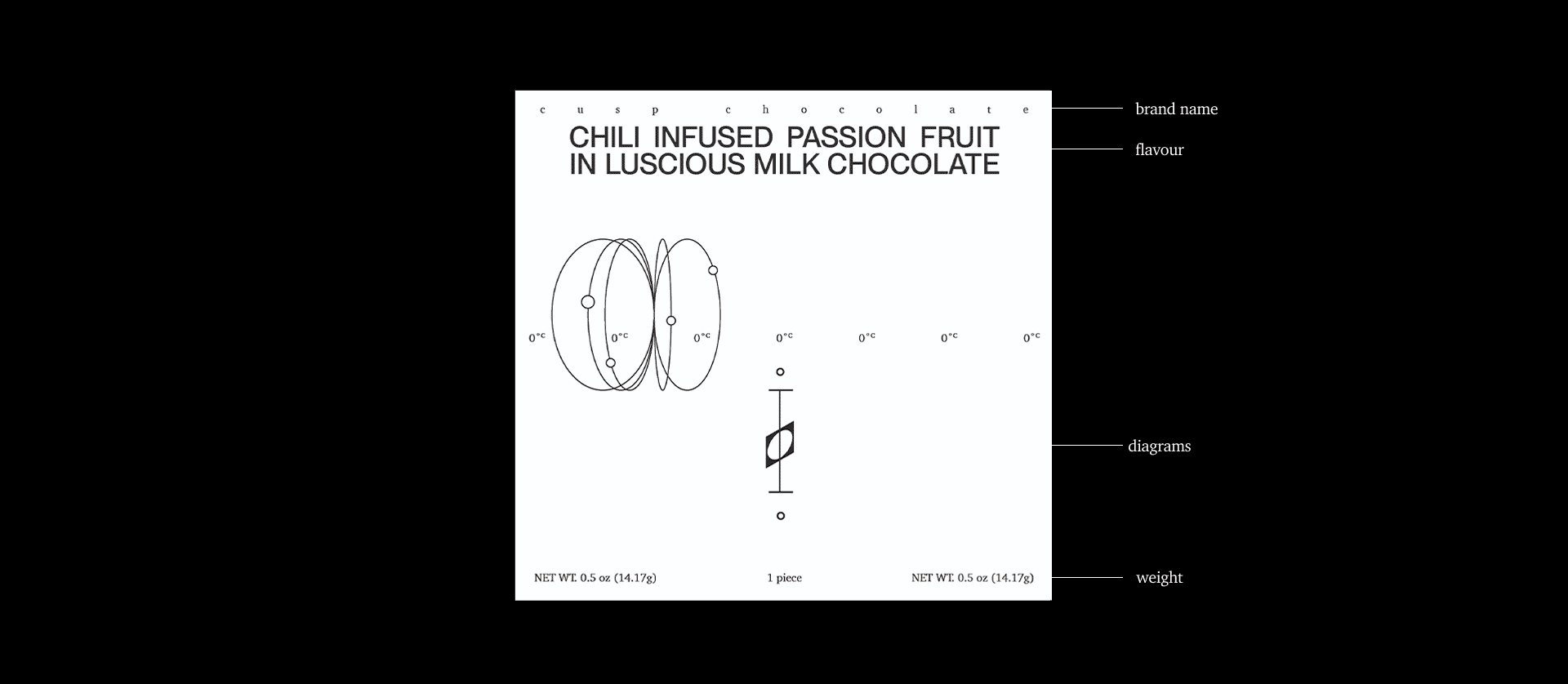
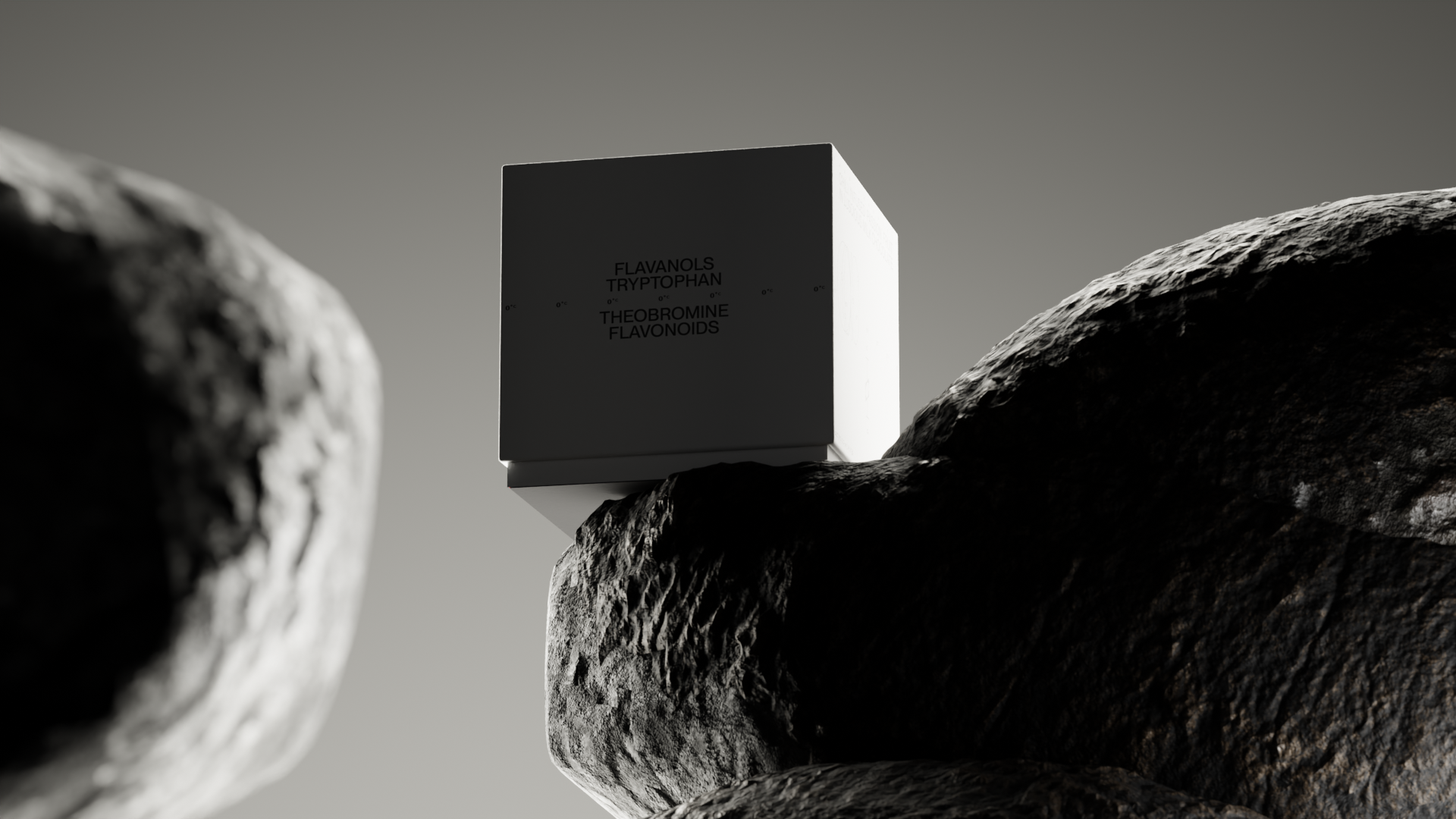
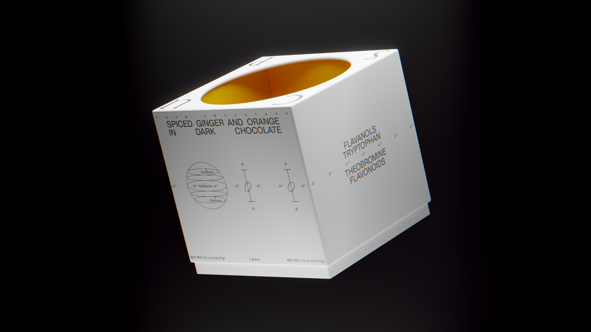
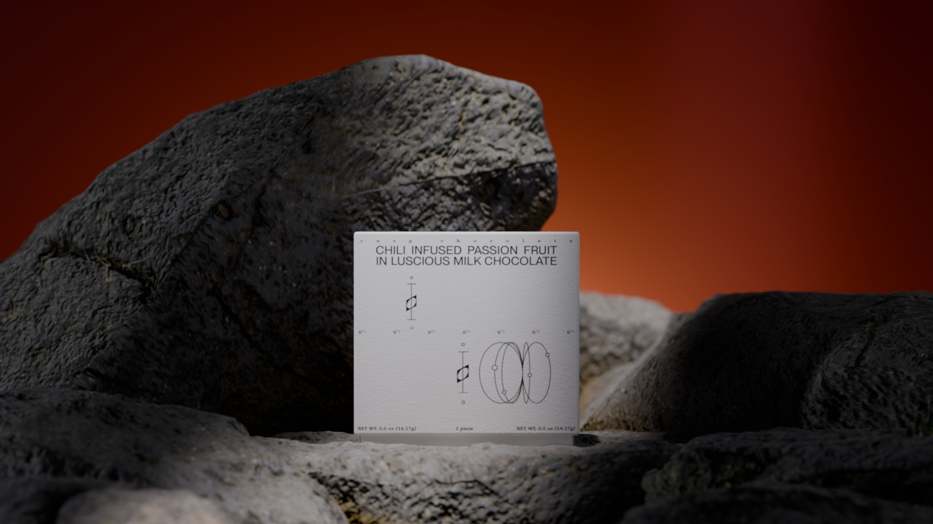
The packaging is designed to create a pause. Its serene white exterior holds the form in quiet restraint, while the interior unfolds in vibrant gradients that allude to the full sensory spectrum of the chocolate within.
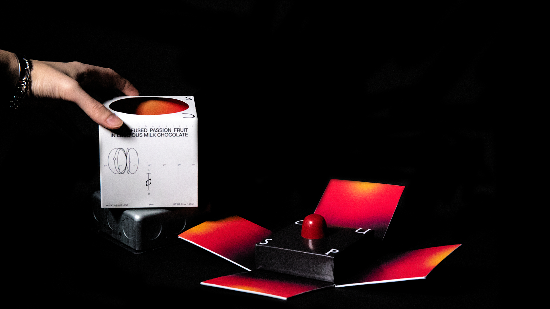
Opening it is a slow, intentional act, revealing the chocolate gradually rather than all at once. The grainy, abstracted depictions of the body in the imagery are soft and tactile, evoking a subtle, elevated sense of sensuality and intimacy.